Pre-Pandemic, Pandemic, and Post-Pandemic Heat Changes In Houston
By
Daniel Ewetuya & Megan Tucker
Results

MODIS March Raster And Rainbow Color Heat
Fig.5
Fig.6
Fig.7
MODIS April Raster And Rainbow Color Heat
Fig.8
Fig.9
Fig.10
MODIS March Change Detection Subsets
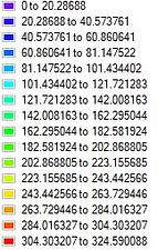
(Rainbow Heat & Raster Legend)
Fig.11 Three maps showing the heat detection change in March 2019 and 2020
The change detection for March 25th 2019 and March 25th 2020 yielded a negative lower end temperatures even though they were supposed to be positive since March 2019's temperatures are higher than March 2020's temperatures. The negative numbers would indicate a reduction in temperature but it is an error because even though the change detection was possible after creating the roi, too much of the data from 2020 was stripped away in the creation of the roi to match 2019 for the band math calculation used to get the above result. It is for this reason that the April subsets were created so a more accurate change detection could be drafted.
Fig.12 Three maps showing the heat detection change in March 2020 and 2021
MODIS April Change Detection Subsets
(Rainbow Heat & Raster Legend)
Fig.13 Three maps showing the heat detection change in April 2020 and 2021
The ROI results between April 2020 and 2021 showed the most significant change by having its temperatures exhibit mostly negative values which in signify a reduction in heat and the positive values signify an increase in heat. The columns were reduced by 1 in order for this change detection to be attained with the use of band math, and a change detection between april 2019 and 2020 could not be conducted because the columns and rows were too far apart during the roi creation for its subset. However we know looking at the raster color slice legend for 2019 that its temperatures were much higher than it was during the start of the pandemic.
LANDSAT 8 Classifications
Fig.14 Houston location shown for reference during classification
LandSat 8 Maximum likelihood Change Detection March (Upper Map)
Fig.15 Three maps showing the change detection for Maximumlikelihood in March 27th, 2019 and March 29th, 2020 (Upper)
Fig.16 Three maps showing the change detection for Maximum likelihood in March 27th, 2019 and March 29th, 2020 (Lower)
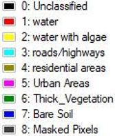
The results appear to show an increase in vegetation which would correlate with a decrease in heat and from the below correlation the areas that appear to be the hottest are the residential and urban areas.
Fig. 17 Two maps showing a correlation between the classified map as relates to the temperature subset
LandSat 8 Maximum likelihood Change Detection April (Lower Map)
Fig.18 Three maps showing the change detection for Maximum likelihood on April 24th, 2020 and April 25th, 2021 (Lower)


heatchange.jpg)


.jpg)
chrest.jpg)


21changeb.jpg)


Change Detection Statistics March (Lower Map)

The upper portion of the map is not necessary since the bulk of Houston is in the lower map but computed and displayed for the purpose of showing a clear distinction between the upper vegetated areas having a lower temperature than the lower left portion of the map having less vegetation where houston is mostly located. This correlation is likewise shown in Fig.16


The statistics results show a decrease in vegetation for the Houston area which would correlate with an increase in temperature.
Fig.19 March Change statistics table 2019-2020

Change Detection Statistics April (Lower Map)

Fig.20 April (Lower Map) Change statistics table 2020-2021
The change detection for April statistics shows a decrease in the number of residential areas and an increase in vegetation. The decrease in residential areas could be a result of a classification error but as is it would correlate with a decrease in temperature; especially with the increase in vegetation
Change Detection Statistics Histogram March& April (Lower Map)


Fig.21 Change detection Histogram for March and April lower Map Image difference Statistics
Although there are issues with classification the image difference between the features shows an increase between march 2019 and 2020 for water with algae but a general decrease in thick vegetation which correlates with an increase in heat, while April 2020 and 2021 shows a massive decline in water with algae and hardly any vegetation but a general decrease in residential areas and a slight increase in urban areas which would correlate with a decrease in heat. The decrease in the number of roads if accurate could correlate with the deconstruction of some roads but that is highly unlikely and would more than likely show that difference as a result of a classification issue attributed to cloud cover changes.